

ClearNight Native iOS App
Stargazers make a four-variable decision every clear-looking evening: cloud cover, moon phase, atmospheric seeing, and light pollution — spread across four different apps, none of which answers the only question that matters: is tonight worth it?
ClearNight collapses that decision into a single 0–100 clarity score with a one-glance verdict. I designed it, defined the scoring model, built it in React Native with an AI pair, wired the subscription business, and shipped it to App Store review — solo, in about five weeks.
This case study walks through the four disciplines that got it there: UX architecture, product strategy, the forecasting engine, and an AI-assisted production build.
ROLE
Product designer, strategist & developer (solo)
TIMELINE
~5 weeks, concept → App Store submission
PLATFORM
iOS · Expo (React Native) · TypeScript
STACK
Supabase · RevenueCat · EAS · Open-Meteo · 7Timer! · astronomy-engine


The shipped app. Score, verdict, best window, and every factor explained — the sky itself is the interface.
THE PROBLEM
A weather app can't answer an astronomy question
"Partly cloudy" tells you nothing about whether the Milky Way core will be visible at 2am. Serious observers cross-reference a cloud forecast, a moon calendar, an astronomy seeing index, and a light-pollution map — then do mental math and drive an hour on a hunch. Casual stargazers don't even know those four factors exist; they just walk outside, see haze, and go back in.
The product bet: don't show people four datasets. Score the night for them. One number, one verdict, one best window — and a push notification when a saved dark-sky spot is about to have a great night. The app's positioning line came straight out of this bet: "ClearNight doesn't guess. It scores."
THE PROCESS
Design like a studio, ship like a team
The project ran in four deliberate phases. The unusual part: each phase produced a written artifact precise enough for the next phase to consume — which is what later made the AI collaboration work.
PHASE 01
Prototype as spec
A click-through, high-fidelity prototype built in HTML/JSX — every screen, state, and interaction, running on mock data. Colors, type, copy, and motion were final design intent, not placeholders.
PHASE 02
Written handoff
A developer handoff package — README, token tables, screen specs, gating rules, backend architecture doc — written as if handing to an outside dev team. Every hex, threshold, and price documented.
PHASE 03
Production build
The prototype recreated in Expo / React Native + TypeScript with Claude Code as the pair — one screen, one service at a time, always pointed back at the handoff spec as the source of truth.
PHASE 04
Ship the business
RevenueCat subscriptions, Supabase push backend, EAS builds, TestFlight, App Store submission, and a marketing site — the unglamorous 40% that turns a demo into a product.
UX & design system
The gradient is the data
The core UX idea is that the app should feel like the night it's describing. Every screen's sky gradient, star density, and accent color are driven by the night's score — a dark, star-dense screen means a pristine night; a washed-out grey one means stay home. Users read the verdict before they read a single number.
That meant the verdict system couldn't be a styling detail — it's simultaneously the data model and the visual model, defined once and consumed by the score engine, every screen background, and the notification copy.
| Score | Verdict | In a word | Accent | Star brightness | Sky gradient |
|---|---|---|---|---|---|
| ≥ 78 | EXCELLENT | Pristine | #8fd0ff | ||
| 62–77 | GOOD | Great | #7ef0d2 | ||
| 42–61 | FAIR | Workable | #ffce8f | ||
| < 42 | POOR | Washed out | #c4ccd6 |
The verdict palette — ported verbatim from prototype to production as a single TypeScript constant.
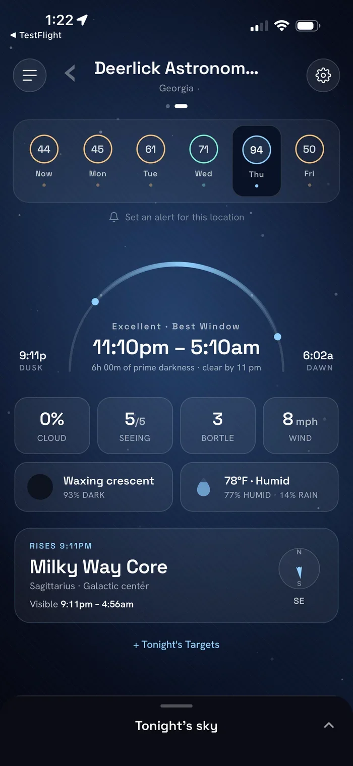
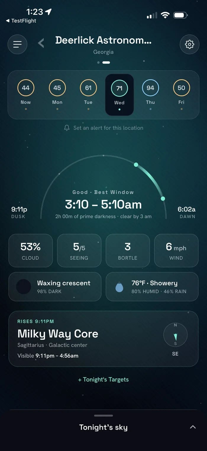
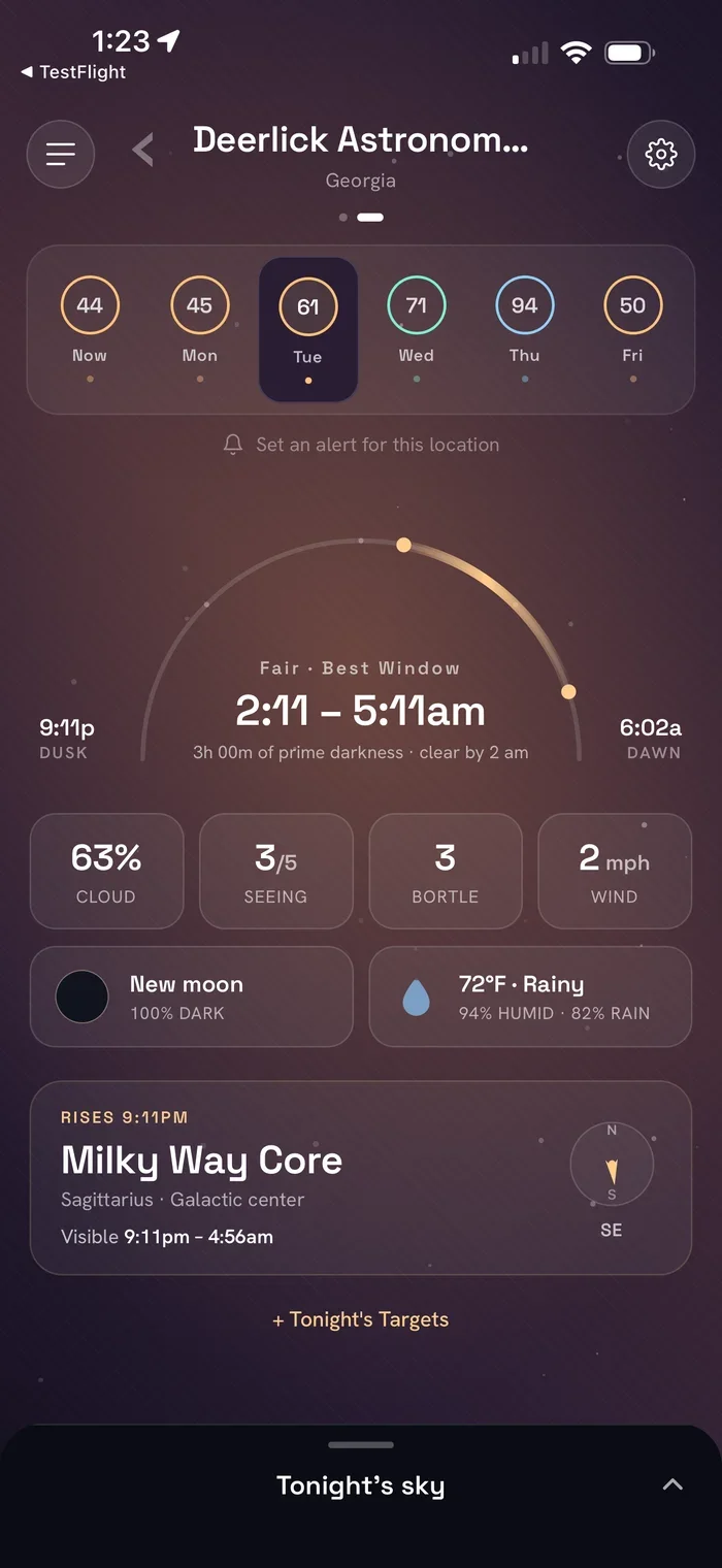
Same components, different night. Blue-black and star-dense for an excellent forecast; warm amber and muted for a fair one.
Plain language as a design principle
Astronomy is jargon-dense — Bortle classes, arcsecond seeing, transparency. Every factor in ClearNight gets a sentence a first-timer can act on: Bortle 5 isn't a number, it's "Suburban skies — bright Messier objects are visible, faint ones are tough." The factor sheets pair each stat with a where-this-falls scale, so the app teaches the domain while forecasting it.
Permission UX, deliberately sequenced
Notification permission is never requested at first launch — only at the moment a user turns on their first GO alert, when the benefit is obvious. Location permission is likewise tied to the "use my current location" action. Small sequencing decisions like these are invisible when done right and fatal to conversion when done wrong.
The engine
Four factors in. One honest number out.
The score is a weighted blend of the four things that actually decide a night, computed from live data per saved location: cloud cover from Open-Meteo, astronomical seeing from 7Timer!, moon illumination computed locally from ephemeris math, and a Bortle light-pollution estimate captured when the user saves a spot.
The weights encode a real observing opinion: cloud is nearly half the score because no other factor matters under an overcast sky. The whole model lives in scoreEngine.ts — one module, so the app and the alert backend can never disagree about what a good night is.
| Factor | Weight | Source | Why it's weighted this way |
|---|---|---|---|
| Cloud cover | 45% | Open-Meteo | The veto factor — even thin cloud ruins transparency |
| Moon illumination | 20% | computed locally | A full moon washes out every faint target |
| Bortle darkness | 20% | per-location estimate | The ceiling on what a site can ever show you |
| Seeing | 15% | 7Timer! Astro | Steadiness — matters most at high magnification |
Beyond the score
The engine also finds the night's best window — the longest contiguous run of clear hours between dusk and dawn, tie-broken by lowest average cloud. Night bounds are computed in the location's timezone, not the phone's, so "tonight" means tonight at your dark-sky site even when you're checking from another state. Rise, set, and transit times for prime targets — the Milky Way core, planets, showers — come from astronomy-engine, computed on-device with no API at all.
The build
The handoff doc was the prompt
I wrote the developer handoff as if an outside team would build the app — token tables with exact hexes, screen-by-screen specs, freemium gating rules, a notification-backend architecture doc. Then the "outside team" turned out to be Claude Code, and that document became the standing prompt for the entire production build.
The method was disciplined and repetitive: one screen or one service per request, always anchored to the spec — "recreate the Home screen matching the verdict palette and thresholds in the README." Design rigor upstream is what made AI velocity downstream possible; a vague prototype would have produced a vague app.
METHOD
Small asks, exact specs
Never “build the app.” Always one component against a written source of truth, then commit. The spec did the steering; the AI did the assembly.
ARCHITECTURE
Human-owned seams
The decisions AI can't own — one scoring module shared by app and backend, verdict system as a single constant, contexts for tier and entitlements — were designed before the code was generated.
VERIFICATION
Real device, every phase
A sandbox test loop — dev build, live bundler, Sandbox Apple ID — validated every purchase path on hardware. It caught a Test Store API key masquerading as the production Apple key before anything shipped.
System architecture
Source to subscriber
Everything involved in getting ClearNight from a design prototype to a working subscription on a physical iPhone.
Product strategy
Free tells you about tonight. Premium never lets you miss one.
The freemium line is drawn on a single principle: the free tier proves the score is real — one location, tonight's verdict — while everything about planning and never missing a night is Premium: the 7-night forecast, unlimited spots, prime-target timing, and GO alerts.
The 7-day trial grants full Premium, then drops to Free rather than hard-locking — lapsed users keep a working product and a daily reason to come back to the paywall. Alerts are the retention engine: the app re-engages users on exactly the nights the product is most valuable.
Annual
$12.99/year
7-day free trial · save 46% vs monthly
Monthly
$1.99/month
7-day free trial, then monthly
Lifetime
$29.99 once
Pay once — for the subscription-averse
Three SKUs configured in App Store Connect, served through RevenueCat as a live offering with localized pricing.


The Premium loop: save spots → compare nights → set a threshold → get pushed when the sky clears.
Going to market
The launch surface
Shipping meant more than the binary: a marketing site at clearnightapp.com, framed App Store screenshots that lead with the value proposition, store copy, privacy policy, and support pages — all in the app's own visual language.
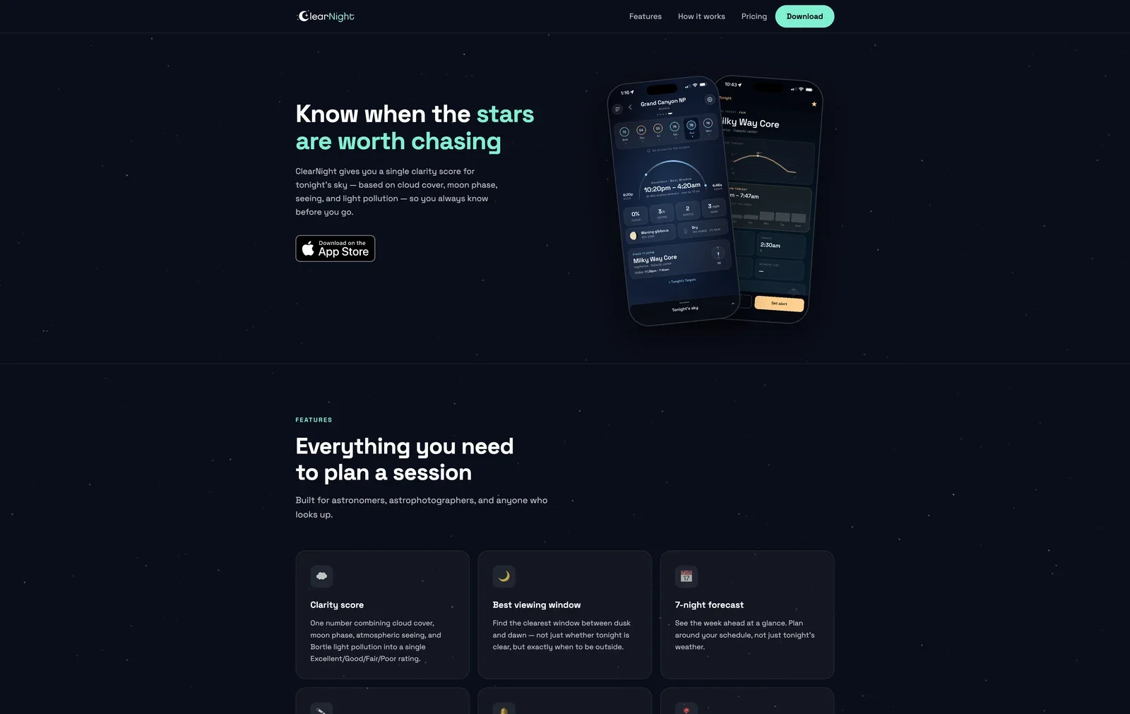
The live marketing site — same tokens, same verdict palette, same voice as the app.
By the numbers
One person. One system behind it all.
Numbers flatten a project, but they also make a point: none of this was outsourced. The same person who chose the mint accent chose the 45% cloud weighting, wrote the paywall copy, set the annual price, and debugged the push token registration. Five weeks covers the full arc — the prototype, the handoff documentation, eighteen production screens, the scoring engine, the Supabase backend, three App Store products, the marketing site, and the review submission.
The number I care most about is the last one: a single scoring module shared verbatim between the app and the alert backend. It's a small architectural decision with an outsized product consequence — the score a user sees on their home screen and the score that decides whether their phone buzzes at 6pm can never drift apart. Most forecast apps get this wrong quietly; ClearNight can't, by construction.
~5 weeks
Concept to App Store submission, end to end
4 → 1
Forecast factors collapsed into a single clarity score
18
Production screens in the shipped Expo app
11
TypeScript services — forecast, scoring, astronomy, alerts, geo
3
Subscription SKUs live in App Store Connect via RevenueCat
1
Scoring module, shared verbatim by app and alert backend
Takeaways
ClearNight started as a design exercise and ended as a business with an SKU sheet, a backend, and a review submission — and the through-line is that each discipline made the next one cheaper. The design system's precision made the AI build fast. The build's single-module architecture made the notification backend trustworthy. The freemium logic made the marketing site almost write itself, because the product's value proposition had already been argued through at the paywall level.
The honest lesson is about where the leverage actually lives now. The AI didn't shorten the thinking — the verdict palette, the scoring weights, the trial-drops-to-free decision all took as long as they ever would. What it shortened, dramatically, was the distance between deciding and shipping. For a designer, that changes the job description: the spec is no longer a request for someone else's roadmap. It's the roadmap.
CRAFT
Spec-grade design pays compound interest
The prototype and handoff doc were precise enough to hand to any team — human or AI. That precision is why five weeks was enough, and why the shipped app matches the design intent pixel for pixel.
RANGE
Strategy through storefront
Market gap, scoring model, freemium line, pricing, paywall, push retention loop, store listing, marketing site — the full product surface, not just the screens.
LEVERAGE
AI as a force multiplier, not a crutch
Claude Code assembled what the design system dictated. The judgment — architecture seams, verification loops, what good looks like — stayed human. That's the working model for the next decade of building.